GoFishing
New webshop and a refreshing of an iconic brand
Client
GoFishing
Platform
Shopify
Launched
2024
Industry
Lifestyle
Markets
1 market
Type
B2C
Services
Visual identity, Design, Development, UX, CRO
The challenge
Go Fishing has been advising passionate anglers with a physical store for 35 years. In the store, the trademark has always been a broad knowledge of the field, the materials and of course the good price.
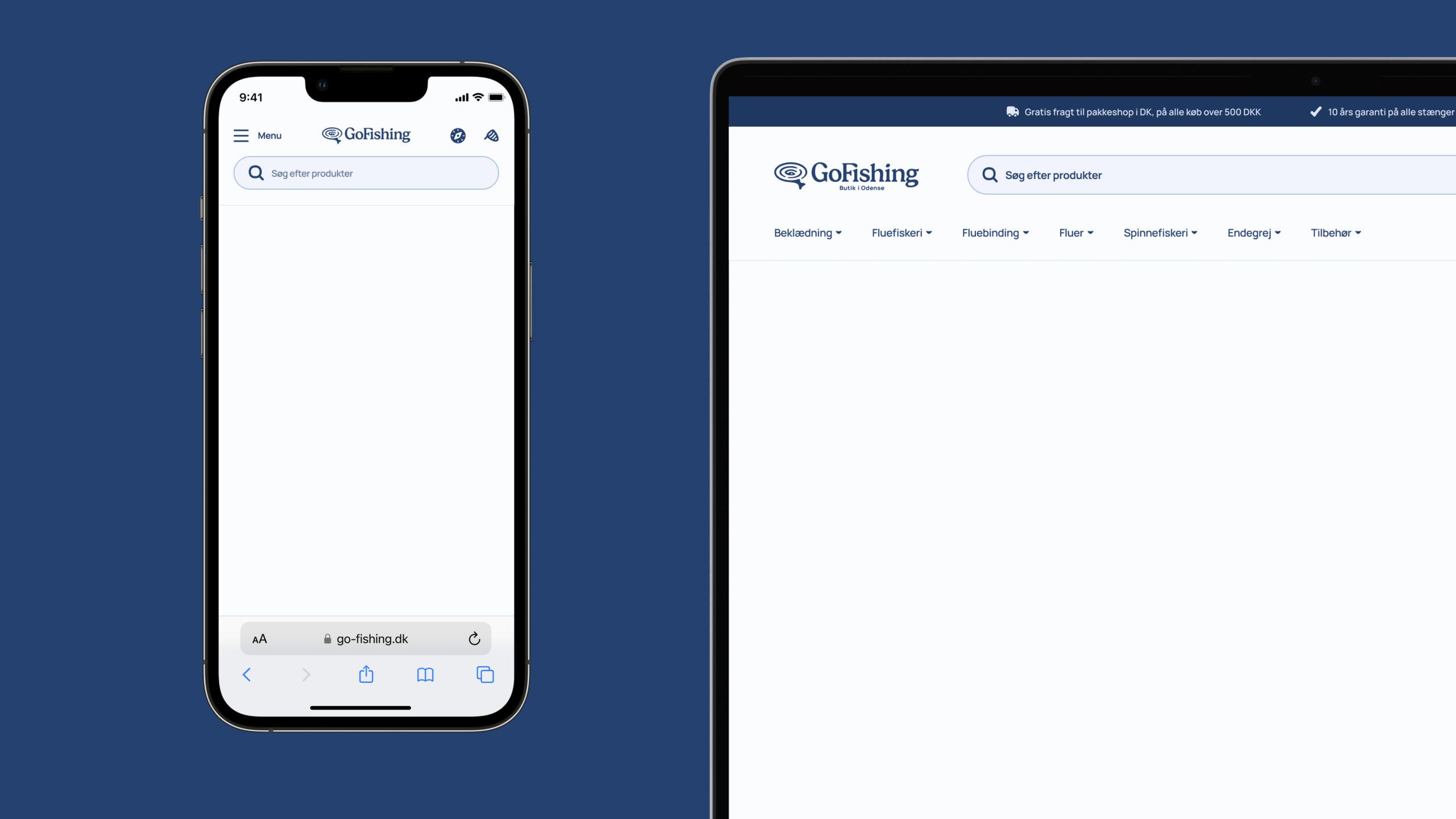
They were stuck with an outdated digital solution that did not fulfill their desire for flexibility and high performance, and at the same time their visual expression was outdated. Our task was to bring the brand of GoFishing onto a flexible and modern digital platform, within a visual framework that is fresh, present and personal. The focus had to be on good advice, but also a sales-converting user interface.
From the beginning, Grafikr approached the task in close dialog with Go Fishing, to ensure that their new visual tone was anchored both with their users and internally with their employees. Through several iterative phases, we collaboratively came up with their new visual expression, which contains a lot of personality and edge, but also contains subtle references to the old design. The inspiration came from nature and the culture around fishing in Denmark. For example, the colors reflect the water's surface at sunrise, while the waves still ripple from the fish in the logo.
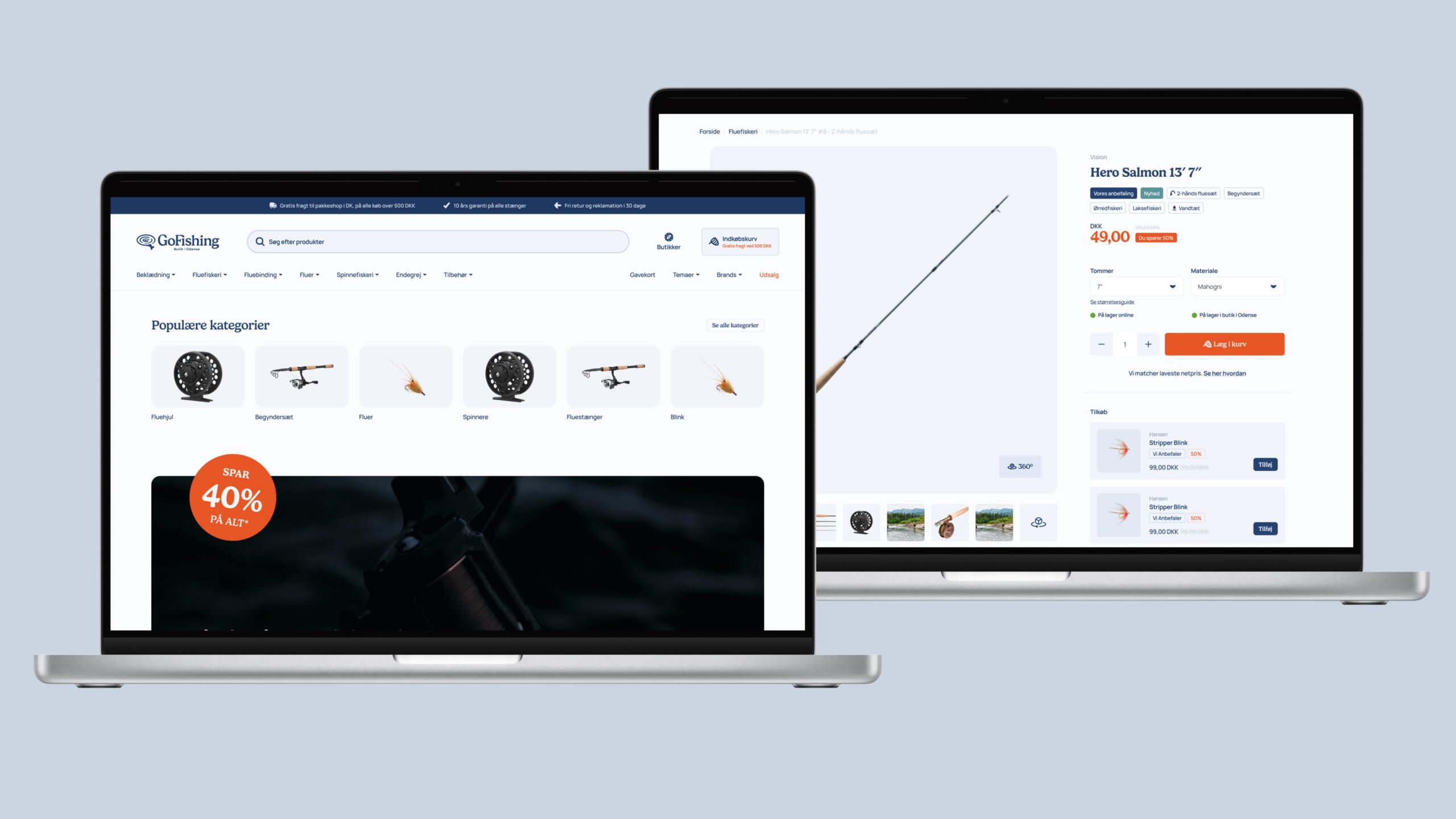
From there, we started designing and developing their new webshop, with a strong focus on flexibility. The webshop is built on a broad toolbox of sections that can be heavily modified, ensuring that GoFishing can quickly and efficiently scale their solution and meet the many changing seasons with fresh and relevant content.
Logo & Identity
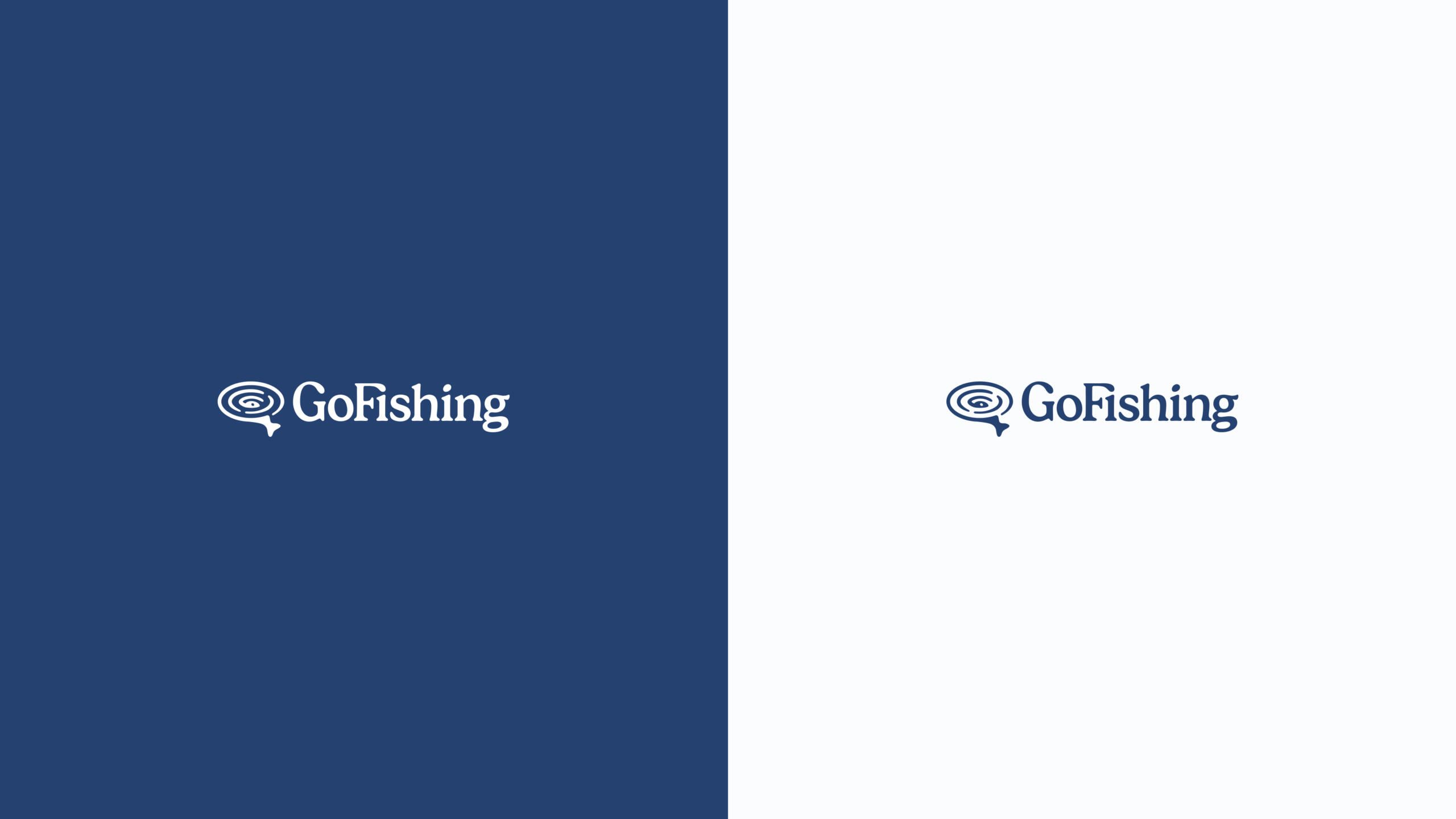
The new logo is inspired by GoFishing's long-standing logo. This way, we maintain the recognition and respect for GoFishing's long history, while also allowing ourselves to look forward.
Both the emblem and the font carry clear visual parallels to the previous design, but have been tightened up and made more personal.
In refining the logo, we have sought to create a classic outdoor expression that embraces the natural and wild, while still remaining modern and relevant.
We looked to the established industry for inspiration and sought to create a design, for GoFishing, that belongs in the category – but also makes it stand out.
Colors
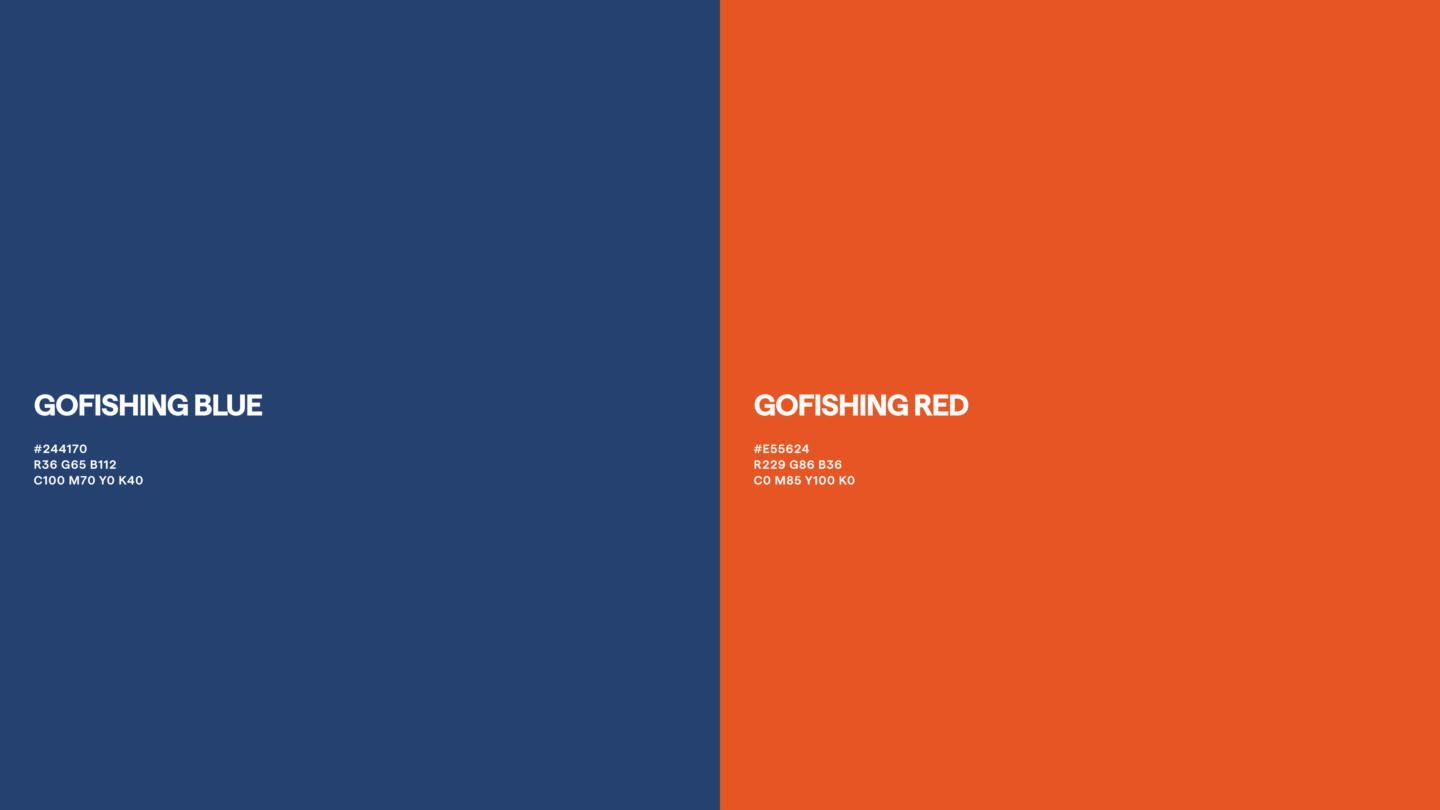
When the sun breaks the water at sunrise and again at sunset, you'll find the angler at the lake, river, pier or harbor - ready for another catch.
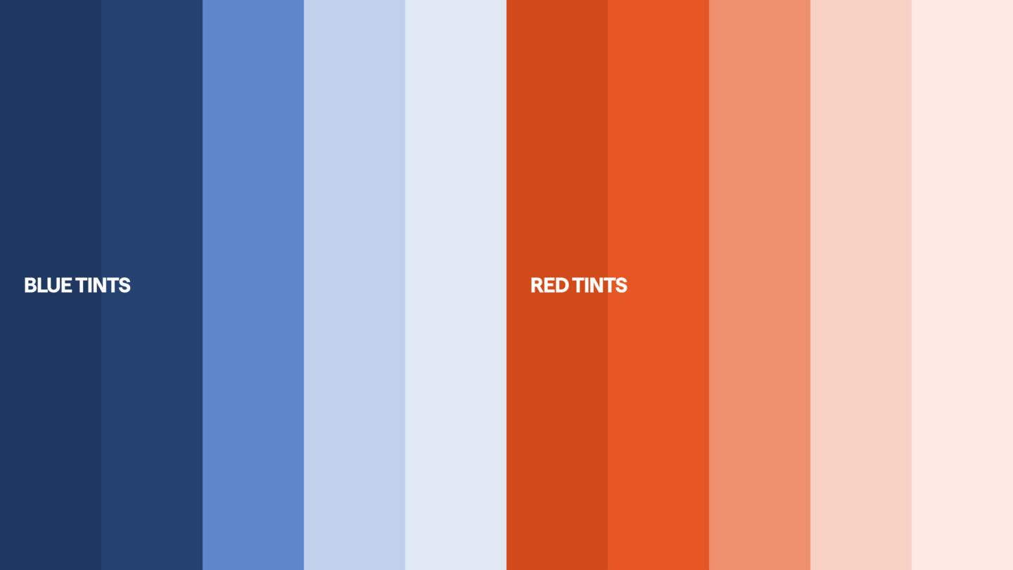
The play of colors between the blue hues of the water surface, broken by the red-yellow glow of the sun, creates the foundation for GoFishing's color universe
Typography
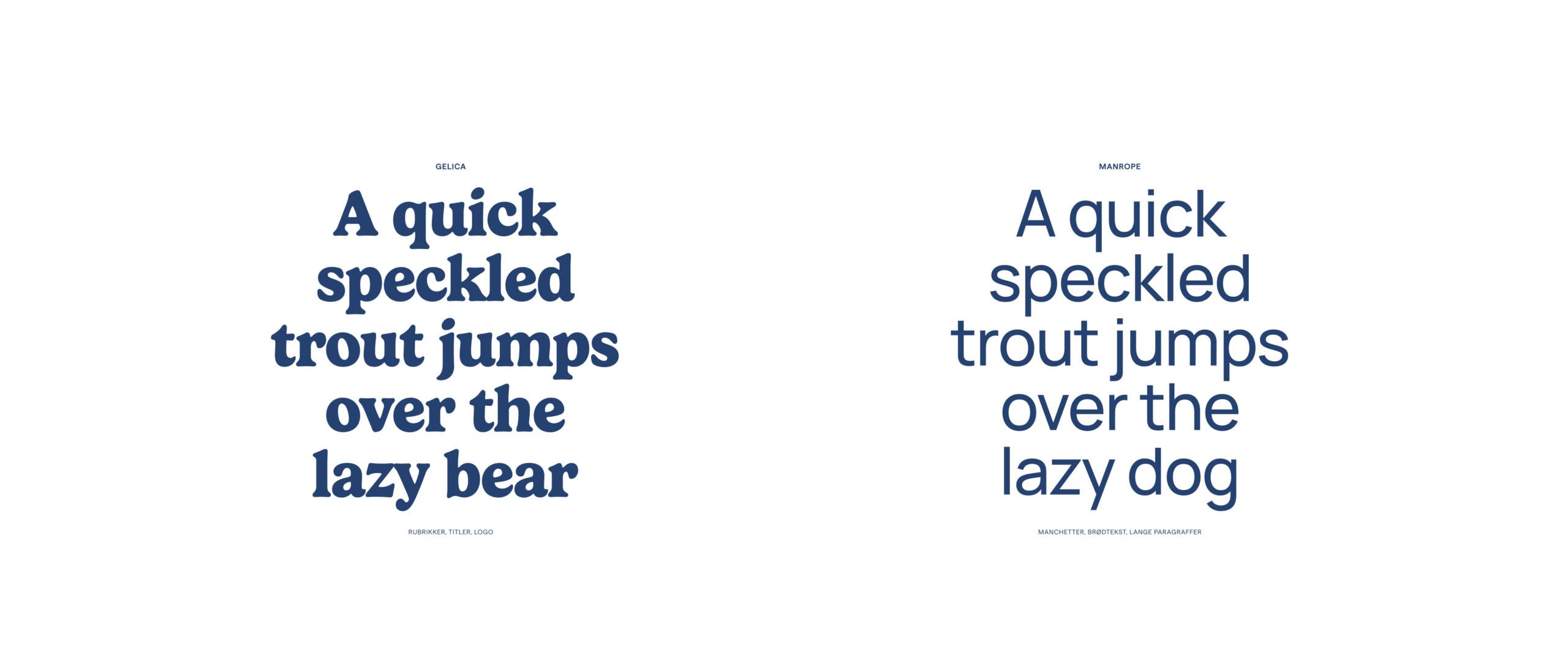
Two typographies form the framework for Go Fishing communication and presentation. They were chosen based on their distinctive character and relation to the maritime.
They ensure interaction with the history of fishing and at the same time look to the future with their modern expression and form.
Concept and solution
How can we highlight expertized knowledge while also helping the customer make the right choice?
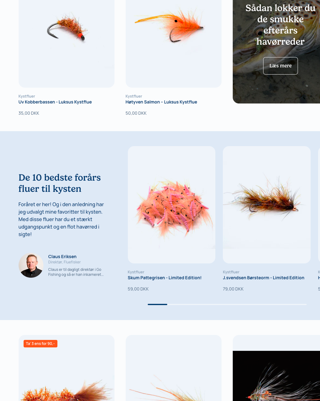
Embedded recommendations in collections, where expert's highlighted products are allowed to stand out. This gives the user a quick overview of which products GoFishing particularly wants to recommend
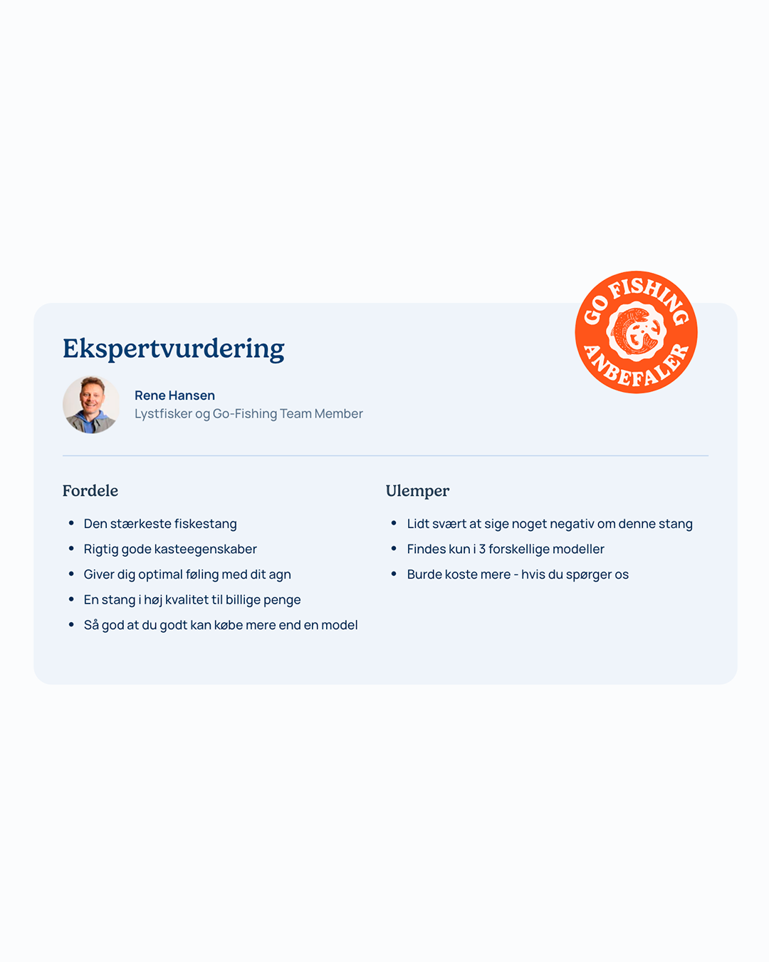
Individual products can be enriched with the expert's take on the pros and cons of the given product. This gives the user an honest and honest interpretation of a product's features.
User interface with focus on usability and sales
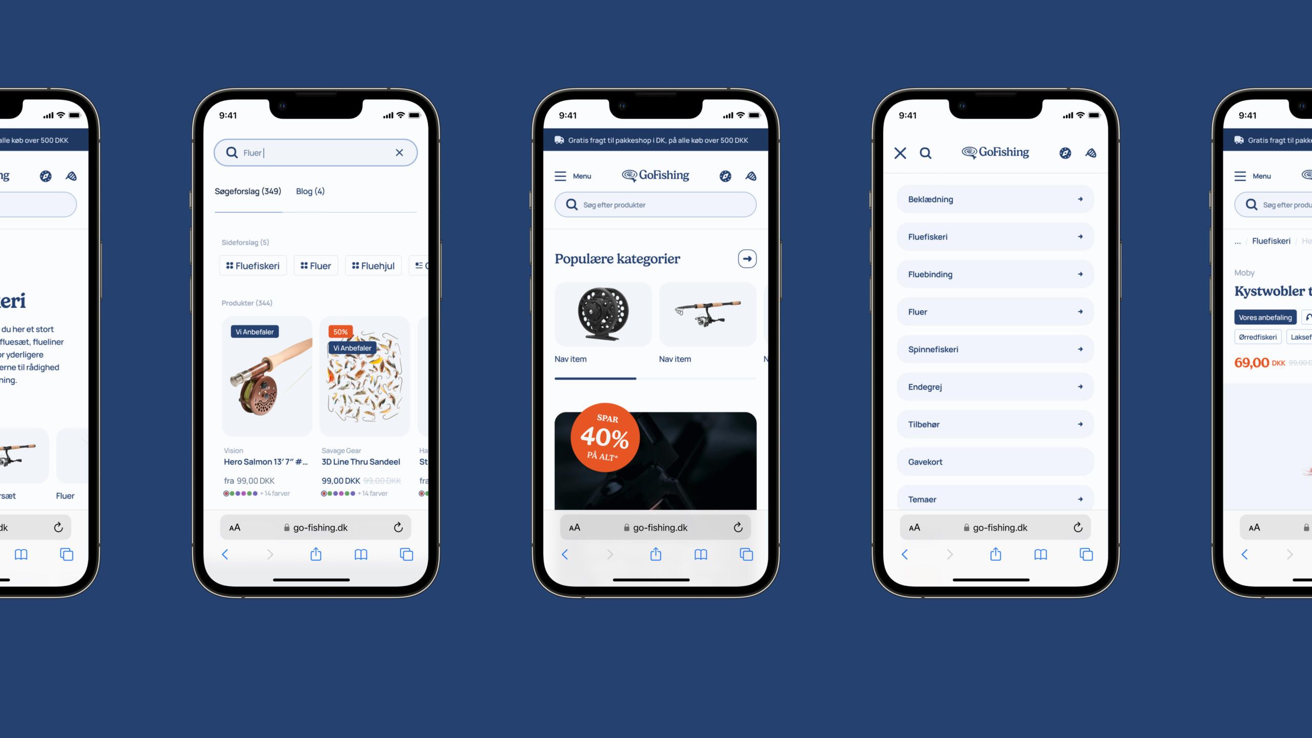
Throughout the webshop, the focus has been on easy access and clarity. We focused on clear and accessible search and the ability to have a large number of navigations quickly accessible.
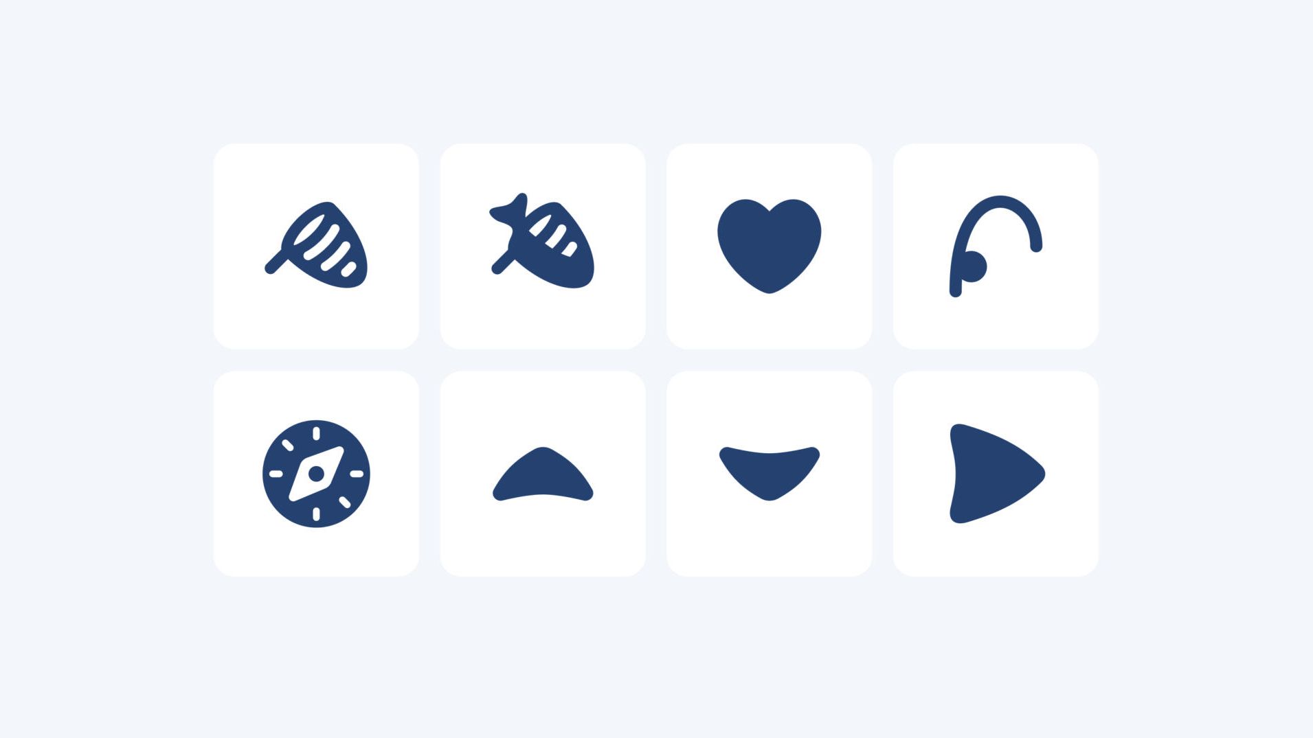
Visual elements are used that draw parallels to fishing. This helps to create a professional and “nerdy” tone of voice that stages Go Fishing as the professional fishing expert.
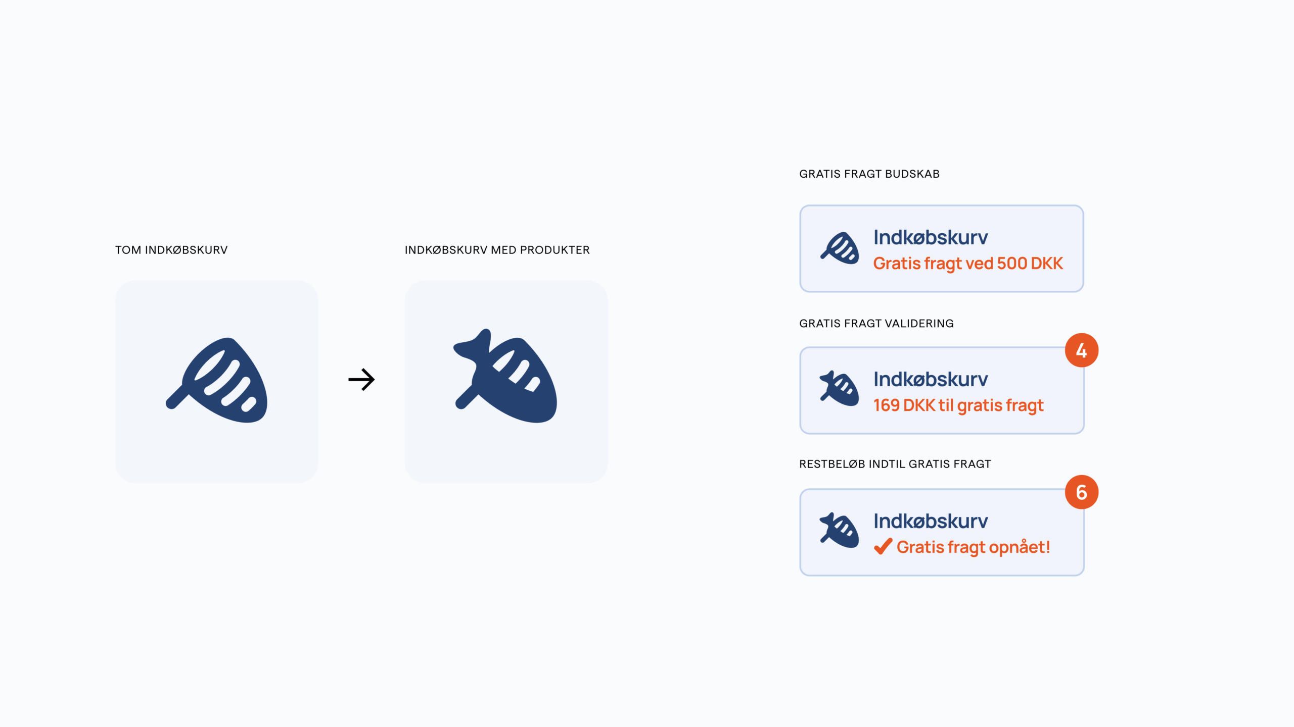
We also use gamification to drive sales. For example, users are encouraged to buy for a minimum of DKK 500 and get free shipping. During the buying experience, users can update themselves on how far they are from free shipping.



The team that brought the idea to life
Next case study
Skagen Clothing
